The process in a nutshell
(some not in particular order)
While the true nature of any design practice are often messy, this process is presented in a way that parallels the outlined challenges.
In reality, the Booking Page was a complex undertaking of almost 2 years. Many steps, details, and nuances were omitted in favor of a more concise presentation.
Feel free to reach out for further details on the process.
Designing for different products
Context gathering
As the problem area was already outlined from initial meetings, context gathering with product teams became a necessary starting point. In-depth discussions with teams were conducted to understand the necessary product context and gather how the Booking Page is and can be used, including related needs for the foreseeable future, resulting in a wealth of contexts (and interests) for different teams.

Co-creation workshop
Inviting designers from product teams for a workshop as an early chance to raise awareness of the project, create ideas of the ideal Booking Page, while building trust and a sense of common problem to unite against.
Gap analysis: existing design vs how it should be
Analyzing gaps between the existing design and the desired version based on problems, needs, requirements, and product contexts to uncover potential opportunities.
Synthesizing
Sitting down with the Booking Page core team to group contexts, requirements, needs, and potential opportunities to surface patterns and make sense of everything.
Key Takeaways
There is no single Booking Page design that could cater all the needs considering all the differences between every product.
There is a pattern of similar requirements between products that can be used as a basis to create similar structure for similar products.
There are only few key differences between products despite their unique cases.
Opportunities for product teams includes the need to place product add-ons (e.g. ✈️ Flight adding options for Baggage, Seat Selection, and In-flight Meals), offer cross-selling (e.g. 🏨 Hotel offering ⛑ Insurance options), and other minor improvements.
The purpose of the Booking Page remains the same despite differences — as a phase for users to book their purchase by filling in required information.
Designing a configurable solution
Analogous inspiration for configurability
When it comes to exploring for the solution, having a wealth of differing contexts was overwhelming. The task of creating a design that could somehow cater for all the product needs became daunting. It was time to actively seek inspiration from other fields: how can many different needs be catered for in a single design?
Fresh inspiration came in the form of role-playing games (RPGs).
It should have been obvious! In RPGs, a single character can be configured through skillsets, perks, or traits to match the style of the player.

Configurable concept
Inspired by RPGs and then realizing that there is no single Booking Page design that could cater the needs of every product led to an idea of a configurable concept.
The idea: enabling flexibility for many cases through a set of designed configurations.
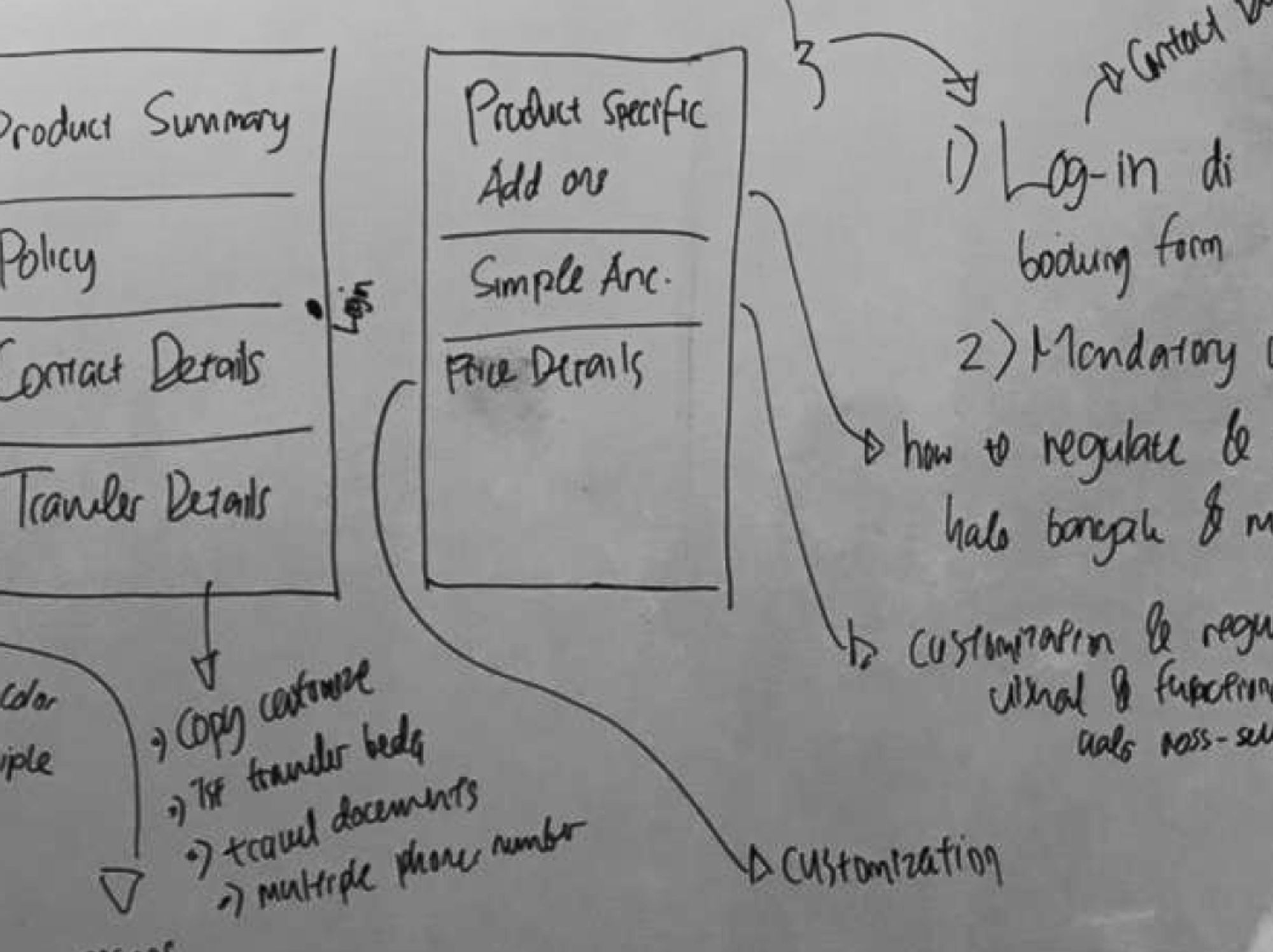
This would give teams the power to design their own Booking Page that would match their needs. After all, they should know what is best for their product. Ideation based on existing design, the results of gap analysis, and some ideas from the co-creation workshop, resulted in a quick wireframe of what a configurable concept might look like.
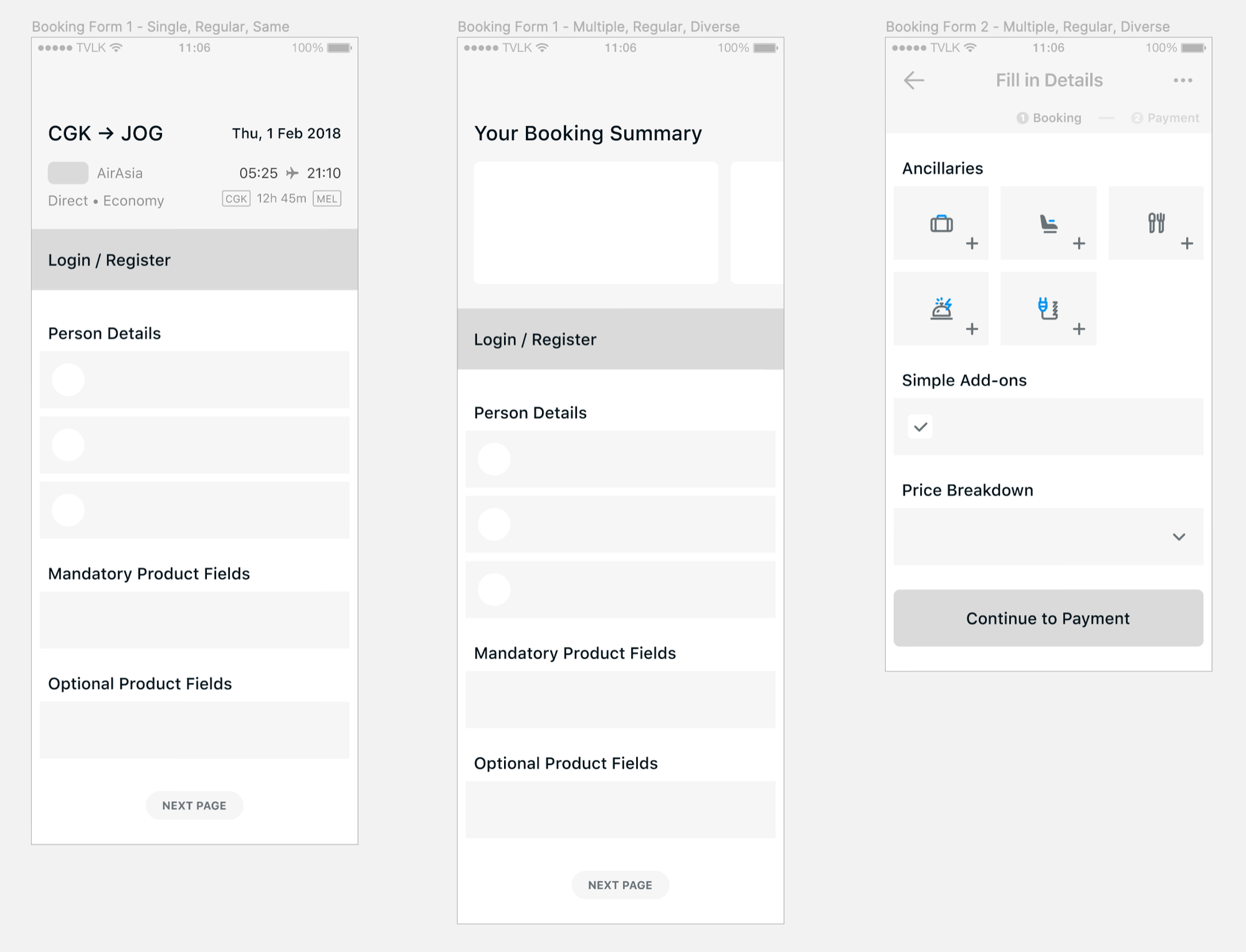
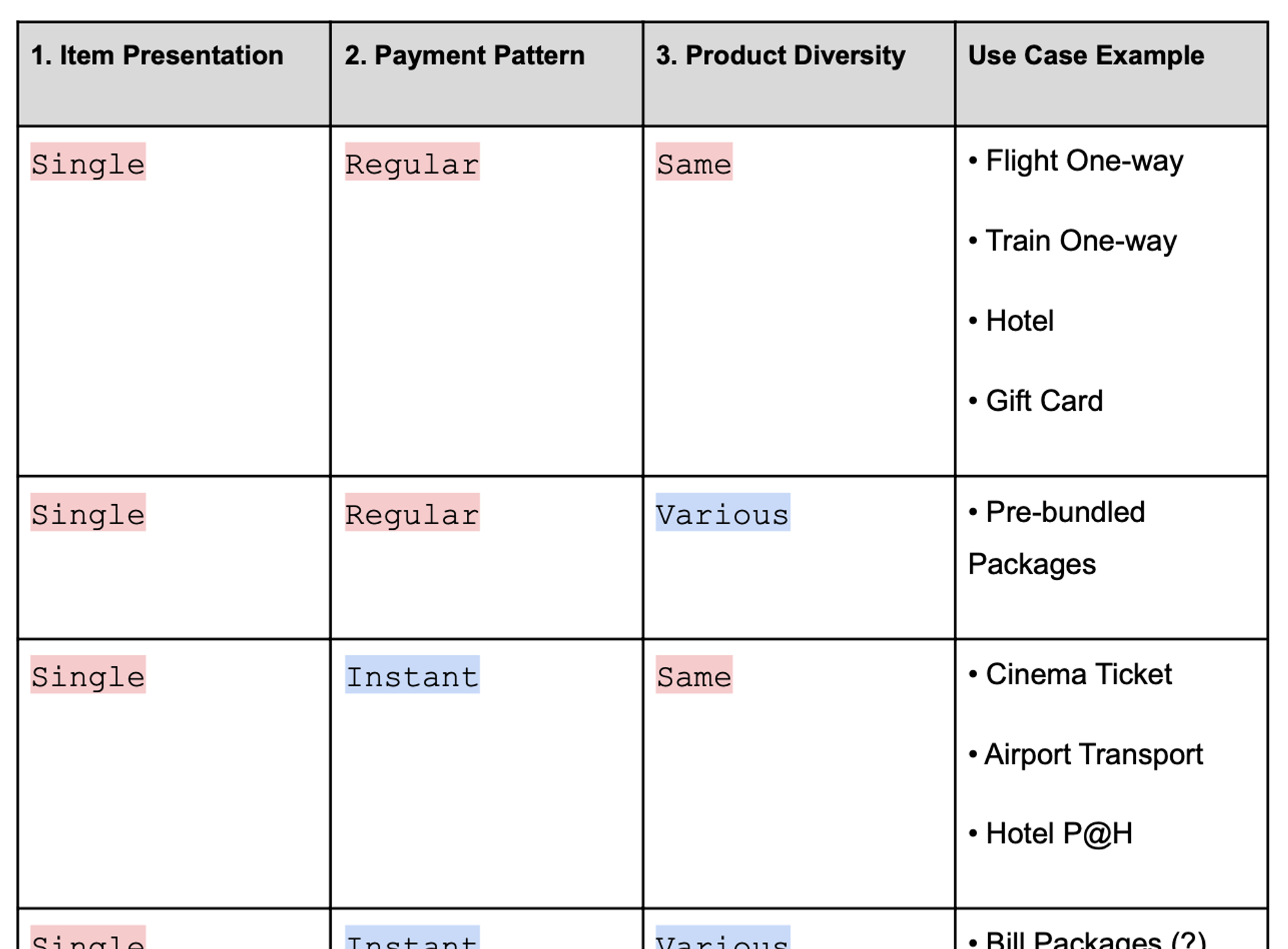
Configure by type
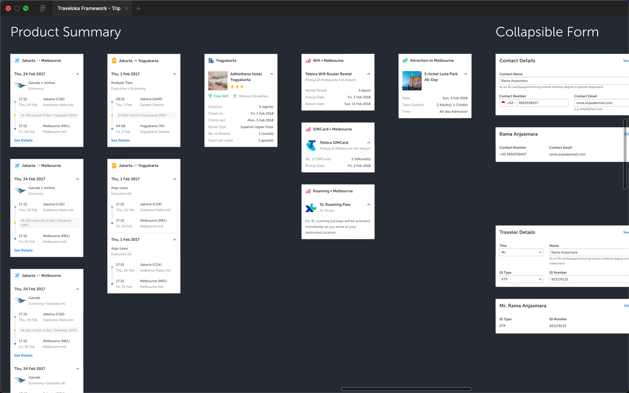
Identifying the key differences that was earlier synthesized became a way to map out different types of use cases. As shown below, each column represents a key differentiator with a corresponding value of configuration that can change the flow, structure, or interface of the Booking Page. Each row represents a combination of values along with examples of use cases fulfilled, resulting in a total of 8 distinctly different types of the Booking Page.
Configure by structure and flow
Depending on the configurations by type, the structure and the flow of the Booking Page can then be further adjusted to meet different product requirements. For example, there would be a different degree of customizability between the "Same" and "Various" value of the "Product Diversity" aspect of the Booking Page.

Configure by components
To emphasize scalability, similar components of existing Booking Pages were compared to create generic abstractions. The abstraction provided a skeleton for creating reusable components. For example, the way information are summarized for ✈️ Flight and 🚂 Train are similar in a way that both require to show a point-to-point display. For products with similar contexts, components can then be derived from that abstraction. However, when necessary, the components can also then be adjusted to cater for more specific needs.
Configurations guided by principles
Despite all the flexibility given, the purpose of the Booking Page should remain the same:
For users to easily book their purchase by filling in required information.
To emphasize this, a shared design principles was made to help product teams focus on the purpose.
1. Forms first, then ancillaries
Always prioritize the users in filling the forms before offering optional product add-ons and ancillaries.
Formulated as a deterrent for product teams that are looking to aggressively place cross-selling, add-ons, and any other ancillaries.
2. Clarity by design
Emphasize on making every single element crystal clear — clear differentiation between information to consume and forms to fill in, clear structure with clear separation between sections, and clear visual cues for every component state.
Formulated for designers to emphasize in delivering clarity of design especially in the more complex use cases of the Booking Page.
3. Progressive disclosure
Display only the most important information first and foremost. Hide supporting details but provide intuitive cues for quick access when relevant.
Formulated to minimize the potential complexity of a Booking Page which may become a barrier for users in filling the required information.
Getting stakeholders on board
Influencing
Dealing with many stakeholders with different interest is hard enough, let alone convincing them to align on a single design. To help with this, a stakeholder map was created to help identify the level of influence and impact that each stakeholder has along with the perceived power dynamics. Identifying the underlying power dynamics helped in making strategic decisions on how to navigate certain situations with certain parties.

Informing
Constantly updating designers, product managers, and engineers of product teams on the progress alongside the rationale behind every design decision to build transparency. At first, informing was done through a form of face-to-face meetings with product teams which quickly became inefficient. The better solution was then to set up a dedicated Slack channel for give bi-weekly updates and cater for more asynchronous feedback and comments.

Involving
Encouraging designers from product teams to be involved hands-on whenever possible. This also means involving them in both concept and usability testing.
Product teams trust their designers' judgment; and when their designers are informed and involved in the design process then influencing becomes easier.
Echoing a reason to believe
As the design process emphasized on catering the perspectives of product teams, realizing their unmet needs and unlocking potential opportunities with the new Booking Page became their reason to believe in adoption.
Ensuring mission-criticality
Rigorous testing with designers from product teams
In the earlier stage of the design process, concept testing was conducted to validate the new flow and structure of the design. Usability testing was conducted in the later stages to evaluate the clarity of the interface and the interactions, especially in unlikely cases with seemingly overwhelming complexity. For this occasion, different scenarios for different products on different platforms had to be accounted for. To overcome this, designers from product teams were called to help with testing their products' use cases.
Continuous feedback loop with product teams
Aside from having regular design feedback sessions, another effort to ensure mission-criticality is to make product teams care enough to oversee the design process. Having both constant updates and direct involvement cultivated a natural feedback loop where product teams became attentive enough to continuously share their perspectives with the Booking Page team.
Partial and selective release
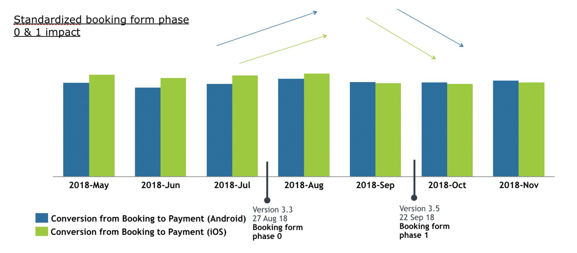
As rolling out all of the new changes for all products in one go is a big risk, the release was chunked in phases — partially releasing the changes and selectively deciding on which products. The earlier synthesizing sessions helped in deciding which features to prioritize and the rigorous testings helped in deciding which products were ready to release.
Close monitoring and iterating
Design never ends.
For after every partial and selective release, active monitoring followed by small iterations was the norm.
Quantitatively, conversion and transaction were set as the main indicators of change. Qualitatively, designers from product teams were encouraged to gather sentiments on the new Booking Page when evaluating the latest release with users while also keeping an eye out for feedback received through customer service.